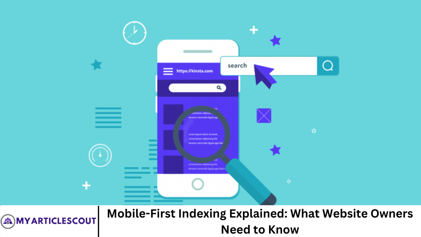
In today’s mobile-dominated digital landscape, mobile-first indexing is no longer a concept for the future—it’s the present standard. With mobile devices driving the majority of web traffic, search engines like Google have shifted their focus to ensure users receive the best experience on smaller screens.
If you’re a website owner, understanding and adapting to mobile-first indexing is critical to maintaining your visibility in search results. In this comprehensive guide, we’ll explain what mobile-first indexing is, why it matters, how it impacts your website’s SEO, and the steps you should take to ensure your site stays competitive.
More Read: How AI SEO Tools Got It Right — And Saved Me Hours of Work
What is Mobile-First Indexing?
Mobile-first indexing means that Google predominantly uses the mobile version of a website’s content for indexing and ranking. Previously, the desktop version of a site was considered the primary version. However, as mobile usage skyrocketed, Google officially announced in 2016 that it was transitioning to a mobile-first approach. By 2020, it became the default for all new websites.
Why the Shift to Mobile-First Indexing?
The shift was driven by a significant change in user behavior:
- Over 60% of global web traffic comes from mobile devices.
- Users expect fast, responsive, and mobile-optimized experiences.
- Websites that neglect mobile usability risk losing traffic and rankings.
Mobile-first indexing ensures that Google reflects how most people actually access the web.
How Does Mobile-First Indexing Work?
When Google’s bots (also called Googlebot and Googlebot Smartphone) crawl and index your site, they now primarily look at the mobile version of your content. If your mobile site differs significantly from your desktop site, this can impact:
- Rankings
- Indexing accuracy
- User experience
- Core Web Vitals and page speed performance
Important Notes:
- Mobile-first indexing is not mobile-only indexing. Google may still look at the desktop version if no mobile version exists, but this is not ideal.
- A responsive website (one that adapts to screen size) is the preferred method for handling mobile-first indexing.
- Content parity between mobile and desktop is crucial. If your mobile site has reduced content, Google will only index what it sees on mobile.
How to Check if Your Site is Mobile-First Indexed
Most websites are now indexed mobile-first by default, but it’s wise to confirm. Here’s how:
1. Use Google Search Console
- Log in to Google Search Console.
- Go to Settings.
- Under Indexing crawler, it will show if your site is being crawled with Googlebot Smartphone (mobile-first).
2. Check Server Logs
- Look for user-agent activity from
Googlebot Smartphone. - If you see frequent requests from this bot, your site is likely being crawled via mobile-first indexing.
SEO Best Practices for Mobile-First Indexing
To keep your website optimized and competitive, follow these essential SEO best practices for mobile-first indexing:
1. Ensure Responsive Design
A responsive website design automatically adjusts to different screen sizes, offering an optimal user experience on any device.
Tips:
- Use a responsive framework like Bootstrap or Tailwind CSS.
- Avoid fixed-width elements.
- Use fluid grids and flexible images.
2. Maintain Content Parity
Your mobile and desktop versions should offer the same core content, including:
- Text
- Images and videos (with alt text)
- Structured data
- Meta tags
- Internal linking
Why? Google will only index what’s visible on mobile. If crucial content is missing or hidden, it may not be ranked.
3. Improve Mobile Page Speed
Page speed is a mobile ranking factor. Use tools like:
- Google PageSpeed Insights
- GTmetrix
Tips to improve speed:
- Optimize images.
- Minimize JavaScript and CSS.
- Use lazy loading.
- Enable compression (e.g., GZIP).
- Leverage browser caching.
4. Optimize for Mobile Usability
A mobile-friendly site enhances user experience and engagement.
Use Google’s Mobile-Friendly Test:
Key areas to focus on:
- Text size should be readable without zoom.
- Tap targets (buttons, links) should be easy to click.
- Avoid horizontal scrolling.
- Don’t use Flash or outdated plugins.
5. Use Proper Structured Data
Structured data (Schema.org) should be present on both mobile and desktop versions.
Tips:
- Ensure consistency between versions.
- Use the Rich Results Test to verify markup.
6. Avoid Intrusive Interstitials
Pop-ups and interstitials that cover content on mobile may hurt rankings.
What to avoid:
- Full-screen pop-ups.
- Difficult-to-close overlays.
- Autoplay videos with sound.
Mobile-First Indexing and E-Commerce Sites
If you run an e-commerce website, mobile-first indexing can significantly affect your product pages, categories, and checkout flow.
Best practices:
- Make product descriptions, reviews, and structured data available on mobile.
- Ensure your mobile site includes all essential conversion elements: “Add to Cart,” filtering options, product images.
- Avoid hiding price details or product specs on mobile.
Common Mistakes to Avoid
Even well-intentioned site owners can make mistakes that hurt mobile-first indexing. Watch out for:
1. Blocking Mobile Resources
Blocking CSS, JavaScript, or images via robots.txt can prevent Google from rendering your mobile pages properly.
2. Using Different URLs for Mobile
If you still use separate URLs (m.example.com), ensure:
- Proper canonical and alternate tags are in place.
- Content parity is maintained.
- You implement redirects correctly.
However, responsive design is generally the preferred approach in 2025.
3. Hiding Content Behind Tabs or Accordions
Google can crawl hidden content, but it’s best practice to ensure important information is readily accessible.
4. Inconsistent Meta Data
Ensure your meta titles and descriptions are the same on both versions of the site.
How Mobile-First Indexing Affects Rankings
While mobile-first indexing itself doesn’t directly penalize sites, your rankings can suffer if:
- Your mobile content is incomplete or thin.
- Mobile usability is poor.
- Page speed is slow on mobile.
- Structured data is missing.
Google wants to serve users the best mobile experience, so sites that fail in this area will likely see a decline in organic traffic.
Preparing for the Future of Mobile SEO
Mobile-first indexing is just one piece of the puzzle. With evolving technologies like Core Web Vitals, AI-generated search results, and voice search, website owners must continue optimizing for the mobile-first world.
Future-Proofing Tips:
- Implement progressive web app (PWA) features.
- Improve mobile accessibility (ARIA labels, contrast ratios).
- Embrace voice search optimization (natural language, featured snippets).
- Track mobile behavior in Google Analytics 4 to identify drop-off points.